Werkplaats Typografie (Year 07)
Sandra Kassenaar
Year 00 started in 1998, when Karel Martens and Wigger Bierma founded the Werkplaats Typografie (WT), an experiment in graphic design education based on a combination of practical assignments and self-initiated projects. In a small building in Arnhem, ten to twelve participants work in a fully equipped studio that becomes like a second – or first, or home-away-from – home for the two-year duration of the course. As they said in one of the early brochures, it is a place in ‘which typographic designers explore the nature of typography: what it was, is and can be’.
Year 00 was also the year in which each new issue of the architectural magazine OASE (designed by Karel Martens since 1990) was made in collaboration with a student at the WT. One could say that the OASE is a cornerstone of sorts, the most enduring and steady assignment at the WT. News of the next issue always creates a bit of a stir, talked about in anticipation: ‘who is doing the next issue?’ There are two or three issues of OASE each year – and ten to twelve people who would like to do one – the odds! The constant search for the most democratic way of choosing the next collaborator, combined with its nine-year tradition in the WT, has made OASE quite a thing. More importantly, I believe that OASE is a good way of learning to deal with a lot of content. It forces you as a designer to be creative in dealing with a tight deadline, a small budget and challenging content.
Along with six others I graduated in Year 07 and didn’t manage to beat the odds. So I asked some former WT students who had done: ‘What is it that makes OASE interesting for a graphic designer?’.
Hans Gremmen, Year 03
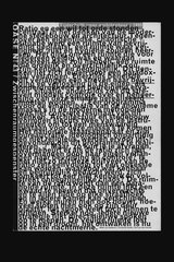
Before Karel started his collaboration with WT students he had already designed around twenty issues of OASE, establishing the structure and fluid organisation of the magazine. In many cases a magazine is designed with a set size, structure, typeface and colour scheme and once these are defined every new issue can be more or less filled in. With OASE only the grid and size are determined, which creates a lot of freedom for the design to respond to the content of each issue. Given so few formal restrictions and the set theme, I was forced to make some well-defined choices that taught me a lot about hierarchy, structure, typographic details and the economic use of the printing process. One of the gratifying things about the OASE series for me is to see the influence of each WT student over the different issues and their different solutions for designing the content.
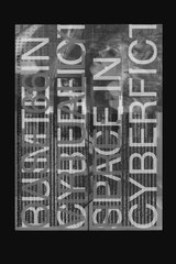
Chantal Hendriksen, Year 05
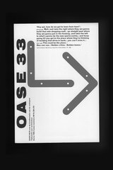
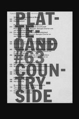
The most interesting aspect, for me, was thinking about the issue you are designing as a part of the OASE series. It immediately raises the questions: What makes an OASE an OASE? And how much freedom can I have within this set of rules and still fit it into the series? My issue was titled ‘Virtually Here: Space in Cyberfiction’ and had a lot to do with film. One of the things we decided was to keep the issue 17 x 24 cm, but make it landscape, which I thought was a more logical format when you are talking about a medium like television or film. Up to now there have only been two issues that deviated from the original format: issue 66, about architecture, and issue 40 (which is half the original size), about poetry. They show that you don’t have to be a slave to your own grid and that’s exactly what makes the OASE series so interesting – the exceptions to the rule.
Jeff Ramsey, Year 06
Perhaps the most important part is sitting with Karel, talking with him about things as you are designing. Learning his opinions and views on design, architecture and life. It is a very privileged collaboration, which I think no designer comes away from lightly.
I’m proud to contribute a selection of OASE magazines to the Reading Room of ‘Forms of Inquiry’ and would like to end with a quote from Karel about the design of OASE:
“It is the same as if I would have invited a guest to my house and prepare a wonderful meal. They enjoy it, but if they come next time, I cannot prepare the same meal again. It is more respectful to always prepare something unique.”*
And many thanks to David Bennewith, Karel Martens and the Werkplaats Typografie.
* Excerpt from an interview by Peter Bil’ak, published in OHNO magazine, no. 1, 1999
-
-
-
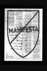
Nicosia This Week. An Unofficial Guide to the Biennial that Never Was
Veenman Publishers, concept by Werkplaats Typografie, edited by Louise Døssing, Maxine Kopsa, Susanne Stetzer, Layla Tweedie-Cullen, designed by Louise Døssing, Darcy Jeffs, Toshimasa Kimura, Jeff Ramsey, Susanne Stetzer, Layla Tweedie-Cullen, Karen Willey, ISBN 90-8690-052-6, 2007
www.werkplaatstypografie.org
-
-
-
-
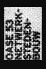
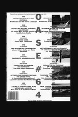
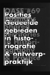
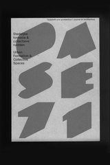
OASE
NAi Publishers by order of the OASE Foundation, edited by Tom Avermaete, Pnina Avidar, Filip Geerts, Christoph Grafe, Klaske Havik, Johan Lagae, David Mulder, Marc Schoonderbeek, Lara Schrijver, Mechthild Stuhlmacher, designed by Karel Martens & Werkplaats Typografie, Arnhem, 1998–2007
www.naipublishers.nl, www.oase.archined.nl
-
-
-
-
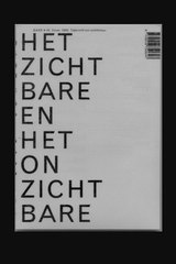
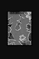
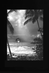
Playback for a Daydream
Werkplaats Typografie, concept and content by David Bennewith, Francesca Grassi, Sandra Kassenaar, Kasia Korczak, Guillaume Mojon, Aya Nakata, edited and designed by Kasia Korczak, 2007
www.werkplaatstypografie.org
-
-
-
-
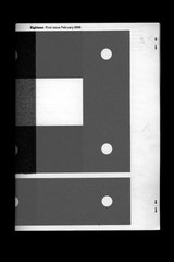
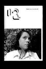
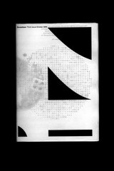
WT Magazines: Eighteen / Twelve / Seventeen / Thirteen
Werkplaats Typografie, edited by David Bennewith, contributions by WT students, covers designed by Karel Martens, Paul Elliman, Armand Mevis, David Bennewith, 2006–2007
-
-
-
-
WT Magazines: Eighteen / Twelve / Seventeen / Thirteen
Werkplaats Typografie, edited by David Bennewith, contributions by WT students, covers designed by Karel Martens, Paul Elliman, Armand Mevis, David Bennewith, 2006–2007
-
-
-
-
WT Magazines: Eighteen / Twelve / Seventeen / Thirteen
Werkplaats Typografie, edited by David Bennewith, contributions by WT students, covers designed by Karel Martens, Paul Elliman, Armand Mevis, David Bennewith, 2006–2007
-
-
-
-
WT Magazines: Eighteen / Twelve / Seventeen / Thirteen
Werkplaats Typografie, edited by David Bennewith, contributions by WT students, covers designed by Karel Martens, Paul Elliman, Armand Mevis, David Bennewith, 2006–2007
-