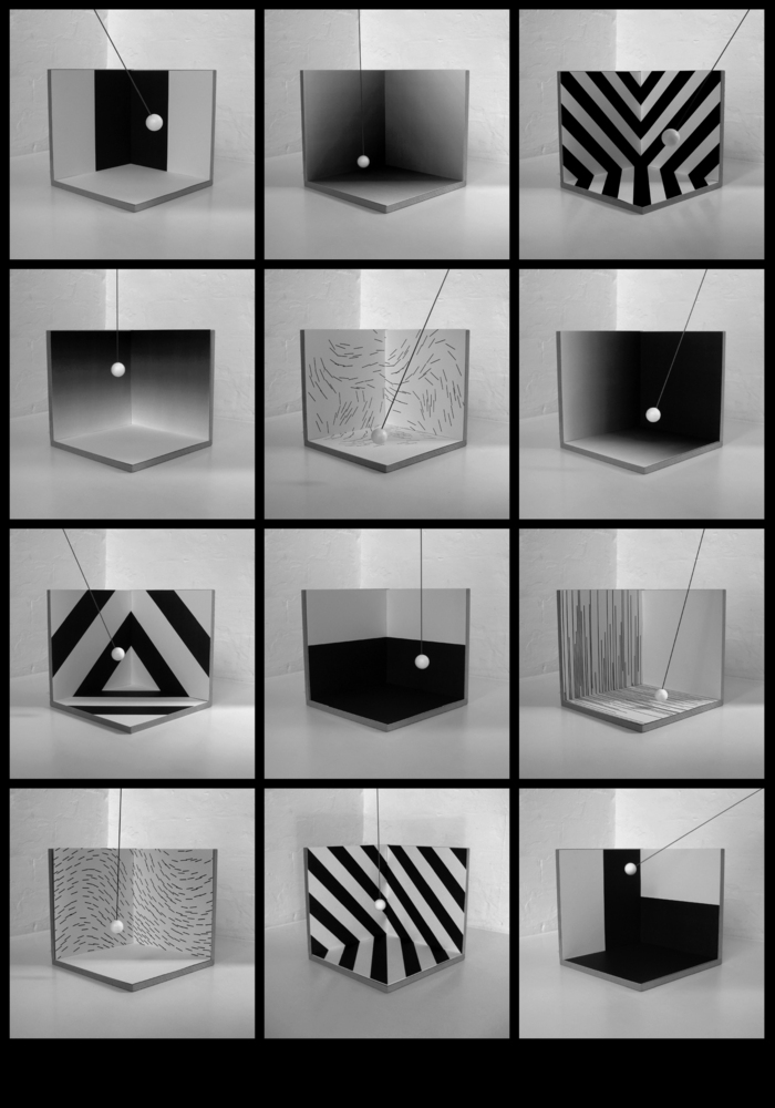
Supergraphics
Hudson-Powell-
-
- Hudson-Powell for the Architectural Association, 2007
-
In The Language of Graphics by Edward Booth-Clibborn (1980), the chapter on ‘The Environment and Graphic Art’ has always stood out for Jody and me. The text and images take you briefly through the history of graphics in the environment, from revolutionary Mexican murals in the 20s, through the neon signs of advertising and on to supergraphics. The term ‘supergraphics’ only appears once in the chapter in the subtitle ‘Supergraphics in the Industrial Landscape’, and it’s here that the work of architects and designers overlaps, the common traits being a focus on colour, geometric or abstract pattern and typography. The following reference explains:
During the 60s, niches of architects and designers began experimenting with supergraphics to emulate the spatial effects of architecture. These designers distorted perspective with stripes and arrows, emphasized wayfinding and movement sequences with surface designs, joined community groups to paint illustrative graphics over blighted buildings, and played with scale by using billboarding tactics. By 1970, this Supermannerist, supergraphic movement had waned, or had morphed into Pop and possibly graffiti art, but the idea that the city could be made bright, even witty, through the judicious application of paint instead of new construction was born and became another tool for developers who had previously advocated demolition as a method of urban renewal.
Marlin Watson, http://www.archinect.com
Amongst our selected projects it’s hard to distinguish which have had supergraphics considered as part of the initial architectural design, and which have used supergraphics as a tool for regeneration. In both circumstances, though, the results are similar — graphics and colour are used to benefit the people occupying the space, and it’s this that we found exciting. A shipyard and a food factory, both potential eyesores, have become points of interest; a school with a large colourful mural stimulates the pupils’ visual education, and the corridors of an institution are brought to life to make the space more functional.
In recent times the relationship between architecture and colour has seemed cautious for the most part, with neutrality as the default setting. Using either raw materials or mute colour is in many cases a considered approach to the building’s environment. But when a council estate, institutional building or industrial structure grows tired, the option to redecorate its exterior and interior in order to give it new life is often overlooked, despite being cheaper and quicker than rebuilding. It’s easy to see why supergraphics failed in the long term, and how its large Pop art designs were very much of the time. It’s also easy to see how, from an architect’s perspective, it’s just a facade, when what you really need is a new building. But supergraphics, like graphic design, is immediate, and should be considered as a viable way for buildings to stay alive and engaging.
We are already in a time, technologically, when the concept of supergraphics can be reconsidered. What was previously a means of decoration post construction can now be considered as part of the fabric of a building: intelligent materials can change colour, electronic wallpaper can change design, augmented reality headsets change your bare-walled room into a palace. It seems relevant to discuss how these technologies will be used, before they are taken over as advertising media. Colour and space could now, more than ever, be used as a way for people to control their own environment.
-
-
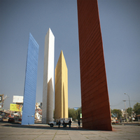
- Torres de Satélite, Mexico. Photo: Taiyo Watanabe
-
-
-
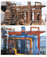
- Solmer steel plant, Fos-sur-Mer © Jean-Philippe Lenclos
-
-
-
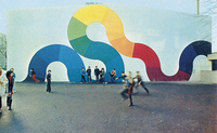
- Wall at Robespierre School, Paris © Jean-Philippe Lenclos
-