Ground Zero Zero
James Goggin-
-

- James Goggin for the Architectural Association, 2007
-
As a graphic designer with an active interest in, but diffident knowledge of, architecture, I have taken the idea of an architectural inquiry literally: to ask some questions rather than attempt a confident statement, let alone provide any answers.
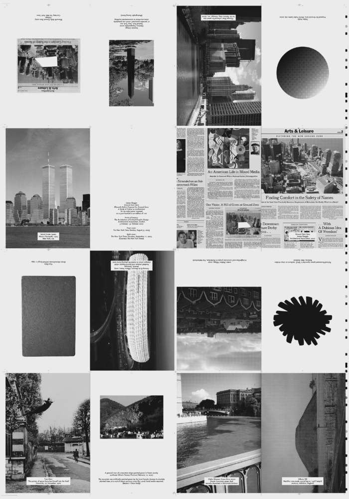
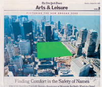
The issue of what to do with New York’s World Trade Center site raises many questions — social, political and symbolic — but for me a key question of interest is whether a void, the absence of any building, might be a more appropriate architectural response to the problem of Ground Zero than another set of towers. A corollary of this is the notion of the void rendered as colour (see Yves Klein), and hence colour as a form of architecture. My thoughts were sparked by an independent, unofficial proposal for Ground Zero by American minimalist painter and sculptor Ellsworth Kelly.
Kelly’s proposal, a collage of a New York Times clipping featuring an aerial photograph of the World Trade Center site, was sent with a letter to the erstwhile Times architecture critic Herbert Muschamp in response to the controversy over the Ground Zero plans. Having initially imagined the site as a large green mound of grass, Kelly was inspired by the aerial view to instead make a simple representation of flat green space: ‘a “visual experience”, not additional buildings, a museum, a list of names or proposals for a freedom monument’.
Others have made similar plans and requests for the site to be kept clear: Kelly mentioned artists John Baldessari and Joel Shapiro and, of particular note, Japanese architect Tadao Ando who actually did propose a grass-covered earthen mound reminiscent of ancient Japanese burial mounds, 650 feet in diameter and 100 feet high. Michael Sorkin Studio similarly proposed a park as memorial for the space, stating ‘The eloquence of the void at Ground Zero will never be matched’.
The references to burial mounds point to the unpalatable fact that the Ground Zero site is of course a mass grave, albeit one that happens to reside in one of the world’s prime pieces of real estate. This is where the debate between development and memorial heats up. Daniel Libeskind’s symbol-laden and increasingly compromised centrepiece ‘Freedom Tower’ (rising 1,776 feet to mark the year of the signing of the Declaration of Independence) is surrounded by a constantly debated and amended ‘masterplan’ comprising a total of five or six towers with around 10 million square feet of office space and up to one million square feet of retail. Critic Philip Nobel summarises the situation as ‘the only politically acceptable solution … a crowded, mixed-use, shopping-intensive corporate development surrounding a large but compromised memorial’.
A blank slate of colour was never going to be an economically (or politically) viable development proposal for the Lower Manhattan Development Corporation, but instead of shoe-horning empty symbolic gestures into designs compromised by security paranoia, I can’t help wondering if New York’s desire for a defiant architectural response to 9/11 might have been best provided by simply rebuilding Minoru Yamasaki’s Twin Towers exactly as they were.
In my graphic design practice, leaving things as found, or even taking things away, can be just as valid a design decision as making something new. Using the problem of Ground Zero as a starting point, Kelly’s collage illustrates an interesting possibility for both graphic design and architecture: a coloured void as a means of satisfying public desire and requirement (in this case for an undisturbed memorial and accessible public space), and of communicating a powerful response to a particular situation (humility and remembrance, not hubris and commerce).
-
-

- Courtesy The New York Times
-